One Teaspoon
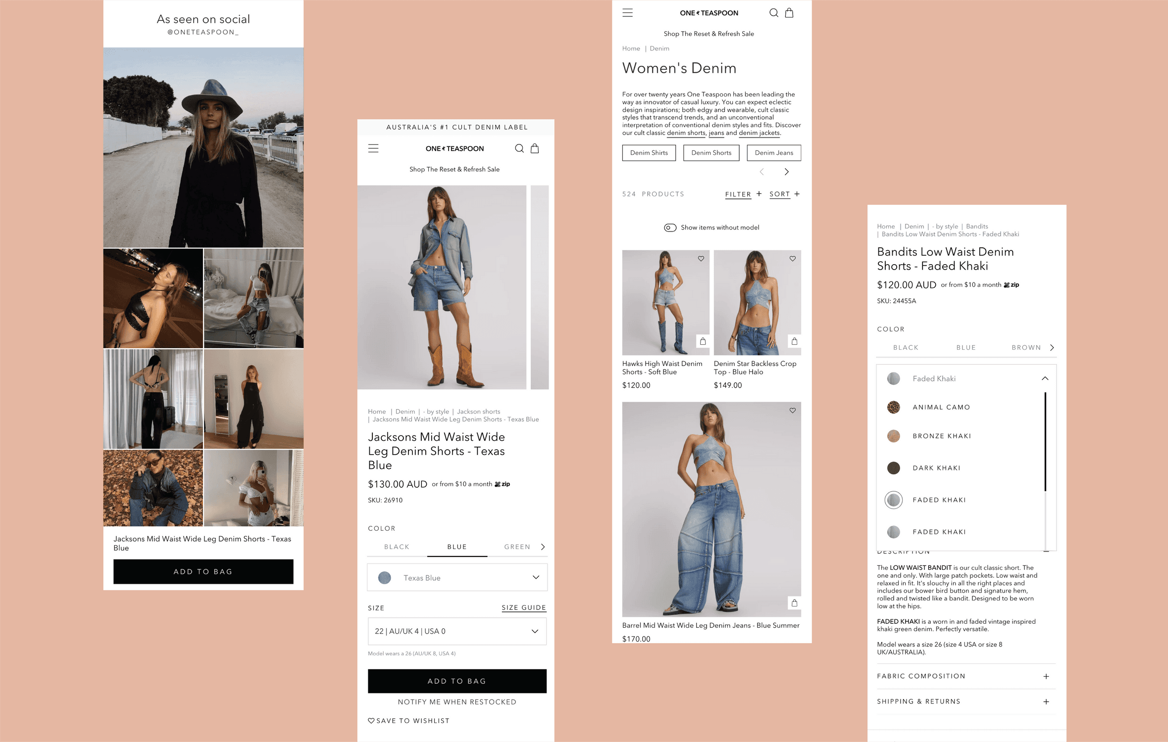
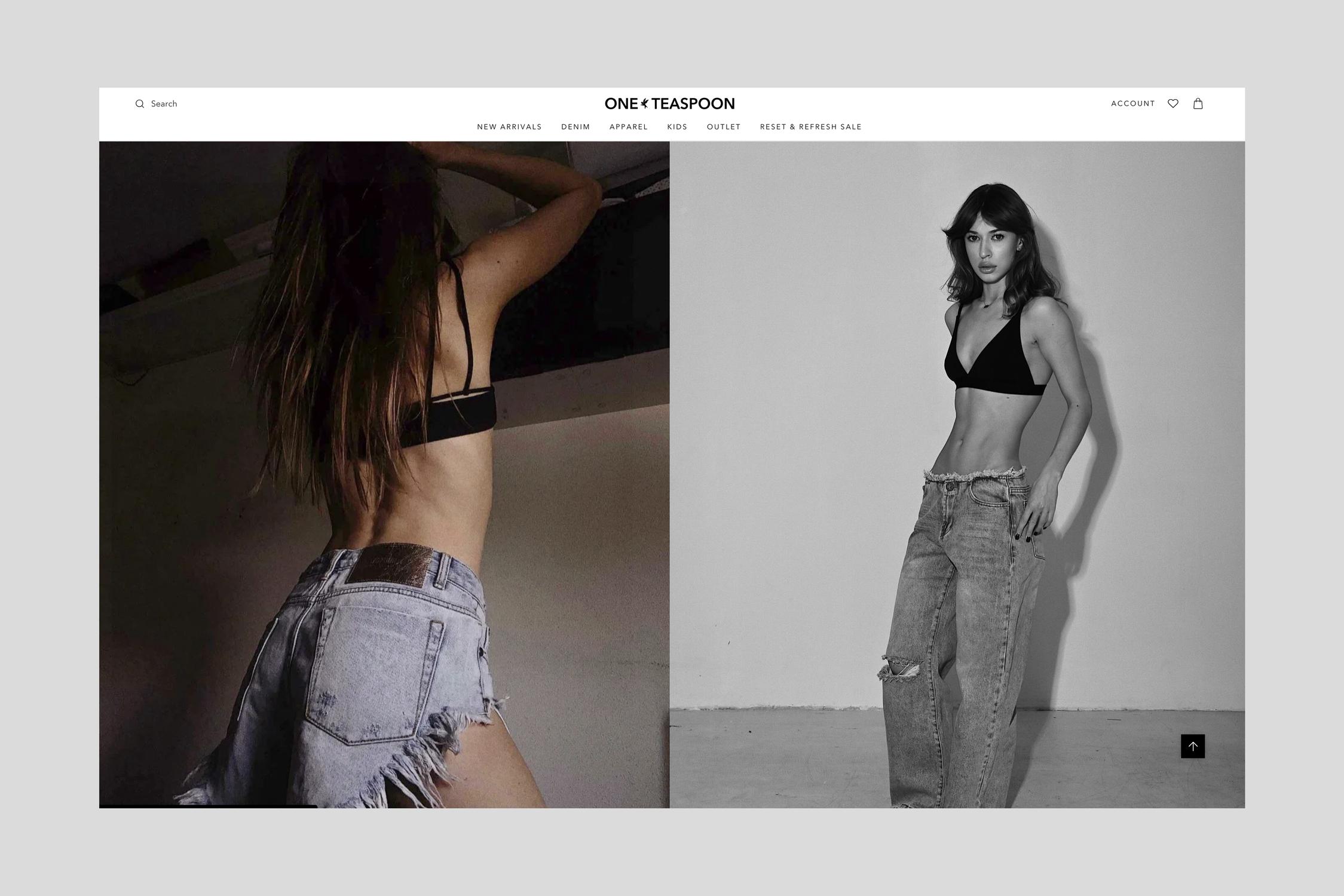
Platform: Shopify Problem: As part of their migration to Shopify, One Teaspoon AU sought a complete redesign of their ecommerce site to better reflect their strong brand identity and improve the online customer experience. Despite their solid brand awareness in the AU market, their signature “cool girl” aesthetic wasn’t translating effectively into their digital storefront. Several customer pain points had been identified, particularly confusion around sizing and color options, which were contributing to high return rates and unnecessary friction in the shopping experience. Compounding this were limitations from a small development budget and a need to stay within the Shopify theme structure. The challenge was to elevate the brand experience within those constraints, while ensuring technical feasibility and streamlined handoff to development. Process: Leading the design, with support from a junior designer, the approach involved working closely with the client’s internal stakeholders, including two main contacts who provided regular feedback. I conducted workshops, led presentations, and collaborated with my creative director for final approvals before presenting concepts to the client. Our audit of the existing site revealed multiple usability and branding issues. Product information was unclear, especially regarding fit and color, and the styling lacked the distinctiveness of One Teaspoon’s brand. Font inconsistencies and an overly templated feel undermined credibility, while poor use of filters and layout led to a frustrating user experience. We approached the redesign strategically, introducing elevated layouts that utilised bold, stylized imagery and simplified headers. Typography, spacing, and calls to action were carefully balanced to better support the brand’s premium feel. A custom tab system was designed to make color and sizing options easier to navigate, especially helpful when more than 50+ options were present. We also restructured content in the right-hand column on product pages to align with ecommerce best practices, ensuring a clearer flow of information for users. Output: The final result is a sleek, on-brand ecommerce experience that feels more elevated and aligned with One Teaspoon’s identity. The new UI not only feels visually distinct from a generic Shopify template but also solves core usability issues identified in the research phase. The simplified header design created a more premium first impression, while custom product page tabs and layout refinements improved the browsing and shopping flow. Brand elements like a subtle icon used in the gallery layout added a personal touch without complicating the development process. On the product grid, items are now displayed in a clearer, larger format, with additional tools like quick links and navigation aids to help users browse confidently. Key UI improvements ensured that navigation, filtering, and product exploration felt intuitive across the board. The final site is easier to use, better at converting users, and a much stronger reflection of the One Teaspoon brand.
Client
One Teaspoon (Project completed while at Overdose Digital)
DELIVERABLES
Shopify theme custom design Responsive design Design library implementation
Year
2023
Role
Design Lead