Pod & Parcel
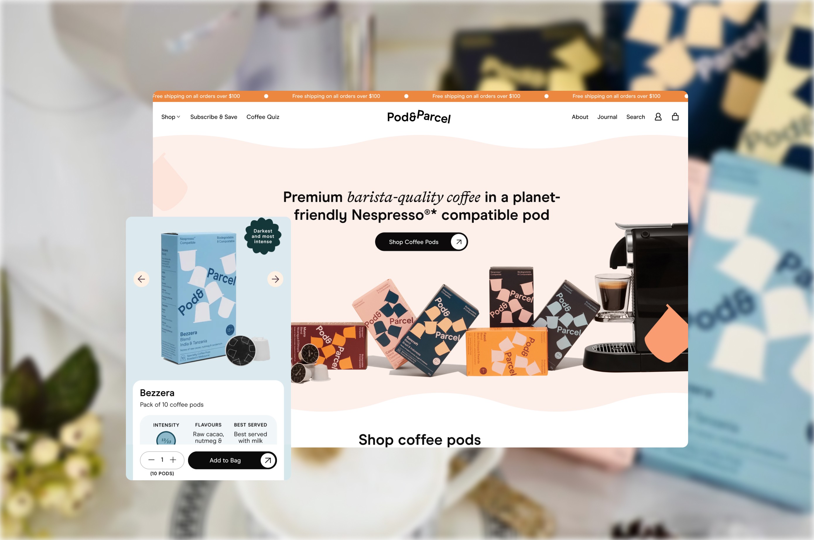
*Completed while at Moustache Republic Problem Pod & Parcel’s existing site needed a refreshed interface that better reflected the quality and sustainability of the brand, while improving overall clarity and visual hierarchy. Key issues included: - Inconsistent visual hierarchy across key pages - Limited use of brand assets to create a distinct identity - Product and content sections competing for attention - Opportunities to better express sustainability and product quality through design Process I worked through a UI focused redesign of key site pages, using existing brand assets to evolve the visual language while keeping the experience familiar and easy to navigate. The focus was on: - Strengthening visual hierarchy and layout structure - Elevating brand expression through typography, colour, and imagery - Improving scannability of product and content sections - Using existing brand assets more intentionally across key touchpoints - Refining component styling for a more cohesive UI system Output Delivered a refreshed UI across desktop and mobile that modernised the experience while staying true to the existing brand. Key outcomes included: - A clearer, more structured page hierarchy - More intentional use of brand assets to reinforce identity *Completed while at Moustache Republic - Improved readability and product discoverability - A more cohesive and polished visual system across key pages
Client
Pod & Parcel
DELIVERABLES
End-to-end UI designs for Shopify build
Year
2025
Role
Lead Designer